Coursera Data Visualization
I highly recommend for everybody who has data to plot or present
After the fun experience of participating in the EdX course Introduction into Computer Science I opted for another course, this time on Coursera.
Data Visualization by Prof. John C. Hart
This page only exists to share my Homework with other students for grading.
The homework is peer-graded and because of the honor-code I cannot publish source code that generated the images. I used Python 2.7 with NumPy and Matplotlib to analyze and plot the data. I think these open-source tools are really worth learning and for most tasks equal or superior to multi-thousand-dollar software.
First data set
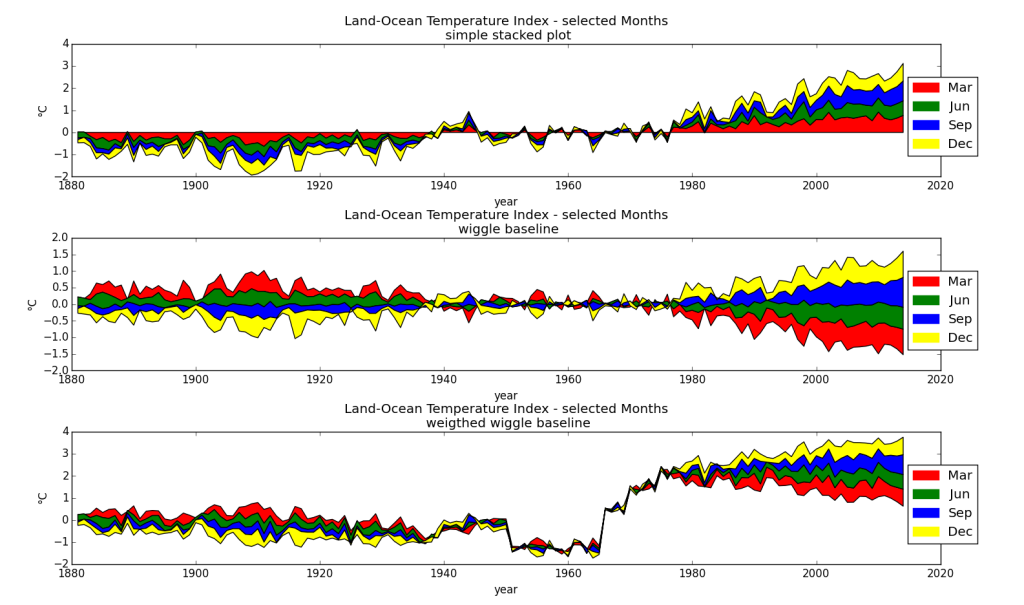
The first data set analyzes the Land-Sea temperature index between 1880 and 2015 for each month. Observations for the plot below:
- The data (independent data = time) for x-axis is continuous so a line graph is appropriate
- I chose Months as dependent data in categories, so I opted for a stacked stream graph.
- Since all 12 moths are too much and the individual months do not show significant differences I selected 4 months, one for each season
- I scaled the data from .01 degrees Centigrade to 1 Degree centigrade, otherwise the values on the y-axis would be quite confusing
- Years with any unavailable data (only 1880 and 2015) have been dropped before the plot
- The colors are chosen for maximum readability admittedly it could be more aesthetic
- I plotted the same data three times playing around with the base-line. I think it is nice to see the increase starting 1960

Second data set
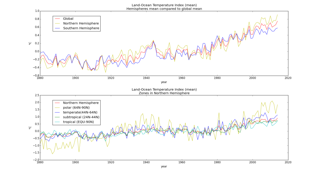
The second data set analyzes the same Land-Sea temperature index between 1880 and 2015 but now with focus on geographical zones. Observations for the plot below:
- The data (independet data = time) for x-axis is continuous so a line graph is appropriate
- As dependent data I show selected hemispheres and zones, this time as a line-graph.
- I scaled the data from .01 degrees Centigrade to 1 Degree centigrade, otherwise the values on the y-axis would be quite confusing
- First I wanted to show how the land-sea temperature index of two hemispheres evolved over time in comparison to he global mean
- When I discovered that for the northern hemisphere the land-sea temperature index was higher than on the southern hemisphere I tried to figure out wich zone influenced most.
- The second plot clearly shows a high volatility for the polar zone and a sigificantly higher value than for the other zones
